
In this article I’ll compare the history to date of the COVID-19 epidemic in fourteen European countries, including the UK. I chose the countries with an aim of making them representative of Western Europe as a whole. I excluded island countries other than the UK and Ireland; and I excluded very small countries such as San Marino, Andorra, Liechtenstein and Monaco. Here are the countries I picked, in alphabetical order:
| Austria |
| Belgium |
| Denmark |
| France |
| Germany |
| Ireland |
| Italy |
| Luxembourg |
| Netherlands |
| Portugal |
| Spain |
| Sweden |
| Switzerland |
| UK |
In hindsight, I might perhaps have added Norway as well; but fourteen should be enough.
The COVID data I used came from Our World in Data at https://ourworldindata.org/coronavirus-data, and runs up to October 31st. But many of the graphs I show will stop short of that date. For example, any graph which requires (centred) weekly averages in its calculation cannot go further than October 28th, because to calculate the centred weekly average for October 29th would require data for November 1st.
Stop Press!
In the last few days, the article I originally planned has been overtaken by political events, as posturing European governments indulge in a game of “COVID copycat” (https://news.sky.com/story/coronavirus-lockdown-returns-to-france-and-germany-heres-what-you-need-to-know-12117280). Ireland has been back in lockdown since about October 21st. The UK will, in effect, be going back into full lockdown from November 5th. Belgium and Germany, will be doing the same from the 2nd, and France is already there. The Netherlands is already in partial lockdown. Austria, Portugal, Italy and Spain, too, are locking down further; and Denmark has already done so, if relatively lightly. Switzerland already has “a range of new COVID measures” – which include making people wear masks outside! Even Sweden is now implementing local lockdowns. As far as I can tell, only Luxembourg has not yet followed the copycat trend; and even there, there is talk of a “lockdown lite.”
It’s particularly exasperating that the UK has decided to go the national lockdown route. A few weeks ago, they brought in a “tiered lockdown” system, in which individual areas could be put under restrictions appropriate to the situation in their particular area, while leaving people in less badly affected areas under far lighter restrictions. This seemed to me a very sensible way to go. After all, epidemic control is, by the nature of epidemics, a local matter. And it doesn’t make sense to confine people in Cornwall, say, to their homes because of a serious situation in Leeds, or even in Bristol. Moreover, slightly different rules in different areas would have created an opportunity to collect hard data on what works and what doesn’t.
Johnson and co could perfectly well have used the tiered system to implement full lockdowns in just those places that needed them. But instead of using common sense and adding a “tier four” to the new system, they have caved in to extremists like the SAGE committee, that seem to want to lock people down for the sake of locking people down. Now we are in danger of a situation, where even those in relatively unaffected parts of the country are likely to be forced into a period of lockdown every few months or even every few weeks. That may make the cases figures look better; but in terms of beating the virus, it’s a no-no. For, absent a vaccine, we are going to have to get to the herd immunity threshold. But to lock down people in areas where there are relatively few cases will mean it takes longer – perhaps, years longer – to get there, and beat the virus. Indeed, someone with a nasty agenda, looking to prolong the agony caused by the virus and to prevent the economy ever fully recovering, would find this strategy very attractive.
Cases
Here is a cases per million population comparison over the whole period of the epidemic, up to October 31st. These are the raw data from Our World in Data.

To help readers separate the strands of spaghetti from each other, I’ve also provided a list of the cases per million population in order, reported up to 31st October.

Another way of looking at the cases data is in terms of daily new cases (weekly averaged) per million population.


In the early part of the epidemic, all countries’ daily new cases started on something like a logistic distribution curve, and then peaked and came down more or less slowly. But now, the story is far more complex. There is a second wave of new cases, starting when the first wave had not yet quite died down. But the onset of the second wave, and its size (so far) in comparison to the first, are very different from one country to another. The onset of the second wave varies from late June (Spain, Luxembourg) through July (France, Belgium) to, arguably, late August (UK) and even late September (Austria). And the second wave, in terms of cases, is significantly bigger than the first. Those who have been saying “the epidemic in Europe is all but over,” I think, need to take another look at the data.
Moreover, according to the Blavatnik School of Government’s “risk of openness” index – which, if I understand right, is their interpretation of the World Health Organization guidelines – all these countries except the last four are above the 200 new cases per million per day threshold, at which the “risk of openness” index automatically becomes 100%. So, above this threshold, no unlocking is recommended under any circumstances.
Whether this threshold is a sensible one is, of course, a moot point. It depends very much on how many infections there are which do not turn into cases, and on what percentage of infected is required to reach herd immunity. In any case, getting to herd immunity at under 200 new cases per million per day would take… a long time.
There’s a third way of looking at the new case data, and that is in terms of weekly new case growth. I plotted the weekly percentage growth in new cases (which are already weekly averaged) for each of the countries. Warning: this spaghetti is very brightly sauced!
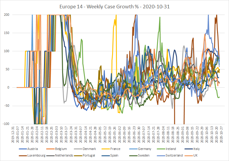
Now, this graph requires some interpretation. The January/February “zeroth wave” is on the far left. Then, the first wave kicks in, starting in late February. Growth was exponential for a few weeks; then some semblance of “normality” was restored. By the middle of April, new cases were on a downward trend in all 14 countries. Which continued for a while. But since then, there has been a slow but inexorable increase in the weekly new case growth, to the point where it is now positive in almost all the countries.
Now, that green line that drops away at the bottom right of the graph is actually a significant feature. That must be the effect of the Irish government’s lockdown measures introduced during October, which include mandatory restrictions on travel and mandatory closures of workplaces. This is the first hard evidence I’ve seen that lockdowns – draconian ones, at least – actually do have a significant effect on the spread of the virus!
Deaths
Here’s the corresponding deaths per million population comparison:

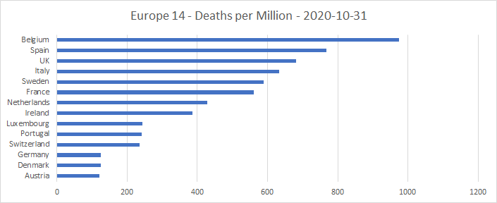
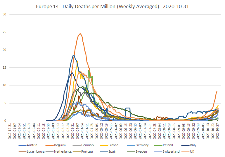
Deaths from the second wave are now detectably increasing in several of the countries. But an even better view is given by the daily deaths (weekly averaged) per million population.

Deaths per case
A third metric which is interesting is the ratio of deaths to cases, with the cases offset by a suitable margin to allow for the time lapse between first symptoms and death. A statistician named Wood has calculated that in the UK at least, this time lapse follows a log-normal distribution, with a mean of 21 days and a standard deviation of 12.7 days. So, after trying several options, I decided to use an offset of 21 days, the mean of this distribution. I also decided to start my graph at 21st August, as prior to that the figures either oscillate wildly, or are badly marred by adjustments.
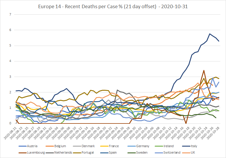
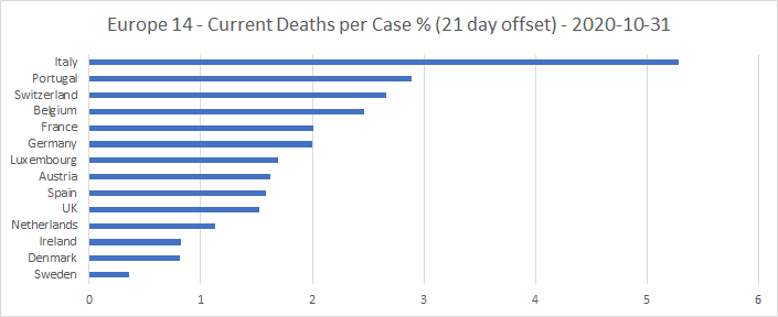
Through August, most of the countries’ deaths per case ratios were going down. This suggested that the virus was getting weaker. From September, though, the ratio started increasing again in several countries. Why Italy is such an outlier, I don’t know.
To compare these recent deaths per case figures with those for the first wave, here are the cumulative deaths per case figures for the epidemic as a whole.
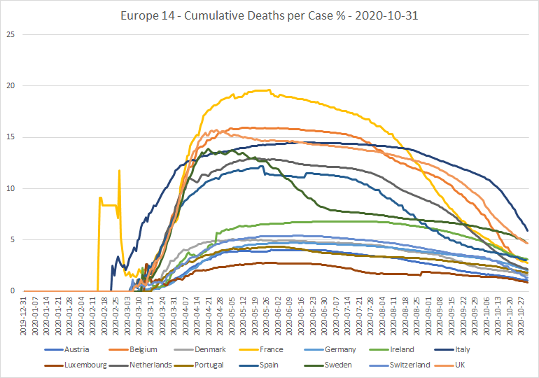
See that big gap in the middle, above the green Irish line? That, I think, may well be “the care home factor.” Those countries above the gap, that didn’t properly protect the people in care homes, lost a lot of these people very quickly. And the only country to start badly, yet get on top of it relatively quickly, was Sweden.

Comparing these percentages with the earlier ones, in many of the worst affected countries the recent deaths per case ratio is now a factor of 5 or more below the overall deaths per case throughout the epidemic. This suggests either that the virus has got weaker, or that the people it is affecting now are generally healthier than those it hit earlier in the epidemic. The improvement in Sweden is particularly noticeable, from about 6% to around 0.5%.
Testing
Another important skein of data is the tests carried out. Here is a graph of cumulative tests carried out per 100,000 population for 12 of the 14 countries. (I chose to use tests per 100,000, because that allowed me, when looking at individual countries, to plot them on the same graph as cases per million). France and Sweden are excluded, because they do not report cumulative test counts. It seems, also, that the Netherlands has not reported any testing data since the end of September. I wonder why?

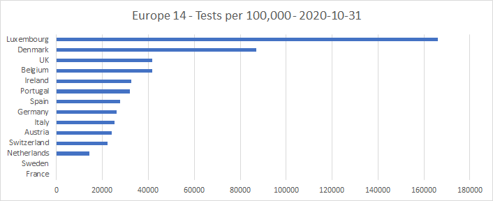
Clearly, Luxembourg and Denmark are well ahead of the rest in testing roll-out. In Luxembourg, essentially the whole population has been tested, many of them more than once.
Another way of looking at the relation of cases to tests is to plot the ratio of cumulative new cases to cumulative tests through the course of the epidemic:
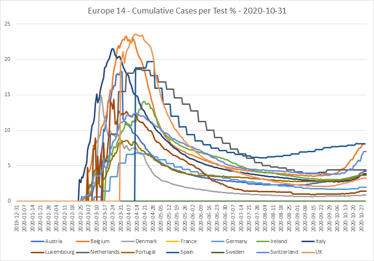
The general trend is that cumulative cases per test reached a bottom at some point in September, although in Spain this happened much earlier, in early August. Since then, the trend has been upwards. A higher case to test ratio might represent either a shortage of test kits, or better targeted use of limited tests, for example using a track-and-trace system. Or, perhaps, a real increase in the incidence of the virus among the population.

Lockdowns
Here is a graph of the Blavatnik School of Government lockdown stringency percentages for the fourteen countries over the course of the epidemic to October 31st.

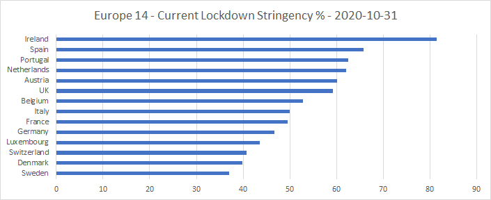
The UK is conspicuous for having been the first or second heaviest locked down country of the 14 continuously from June 8th to October 13th. Though as at October 31st, it comes in merely sixth. But by the time the Blavatnik data filters through from the latest round of lockdowns, the graph above will be much further to the right, and the order will be different.
I had planned to look in more detail at each country’s COVID history. But given that governments right now seem to be playing the game of “anything you lock down, I’ll lock down harder,” I think it’s probably better to wait a month or so, to see what effect these actions have. We might even get, at last, some real idea of which policies actually have a measurable effect and which don’t!
Discover more from The Libertarian Alliance
Subscribe to get the latest posts sent to your email.
It looks like you’ve swallowed this lunacy and you want to debate how unfree we should be. Should it be Tier 1 or Tier 2? Tier 3 or Tier 4?
I am sure there probably is a virus, but frankly, there has been an intentional overreaction and an abuse of power. There is absolutely no need to wear a face mask and I will not wear one under any circumstances. The statistics are bogus. The infection is being routinely misdiagnosed and deaths are being attributed to it when people have died of other things.
It’s all one big fat lie.
Tom, I think there are several issues here, and it’s important not to conflate them.
First, the virus is real. I personally haven’t known anyone who has died from it, but some of my friends do. Now, a proper libertarian “government” in such a circumstance would merely publish the truth, keep it updated, and let people make their own decisions. But, as we know, politicians are incapable of doing anything like that. If there is real danger of running out of medical and hospital resources in particular areas, there is a case to be made for reasonable and temporary restrictions on inter-personal contact between people in those areas. But that’s as far as it should ever go.
Second, the matter of intentional over-reaction and abuse of power. Yes, that is exactly what has happened. As I noted in my article a couple of weeks ago, the pressure to lock down has been coming from SAGE – an unelected and predominantly “woke” group of “experts” with nothing to lose if the policies they advise bring hurt or even ruin to ordinary people. That is why the “tiered” system was devised in the first place – when, six weeks or so ago, many Tory MPs came to realize that they (and their party) were in deep shit if a second national lockdown went ahead. Johnson has now thrown them – and us – under the bus; and this is not something that can ever be forgiven. The members of SAGE shouldn’t ever be forgiven, either.
Third, masks. I have never seen any hard data that proves (or disproves) that masks have any effect on virus transmission. I’m inclined to think that masks worn by ordinary people have no effect, or may even make things worse (because the mask becomes a trap for the virus). Certainly, the circumstantial evidence is that new cases have been trending steadily upwards ever since the mask-wearing was introduced. I suspect this is another case of overreach. It’s all down to the awful system we suffer under – in which those that make political decisions aren’t held personally responsible when those decisions cause harm or inconvenience to innocent people.
Fourth, deaths “with” COVID as opposed to deaths “from” COVID. There certainly was overstatement of COVID deaths at the beginning. I understand that they changed the definition of what was a death from COVID a couple of months ago, which was supposed to fix the problem. I don’t know whether or not it has.
I broadly agree with what you say, but on one or two specific points I strongly differ. Yes, the virus itself probably is real, and even if it’s not, it’s probably sensible to assume it is on the principle of an abundance of caution. But I don’t believe any of these restrictions were ever necessary and I reject them and I will not obey.
It’s funny that of all the people who comment on this blog, I’m the one who regularly offers critiques of libertarianism, yet here I am also the one who is – so far – refusing to obey and insisting on my personal autonomy.
I am now pretty much the only person I know who does not wear a mask. I went out today. I live in a town of roughly 30,000, and virtually everybody I see wears a mask. It’s 99.99%. I seem to be the only person in the entire town who does not wear a mask.
Where does this leave me? Does this mean I am in some sort of awful Twilight Zone-type nightmare in which I am living in an open nuthouse and everybody has gone insane? Will I be carted off to the loony bin myself, on a similar pretext to Soviet dissidents who were confined to psychiatric hospitals?
I just don’t understand the situation we’re in, save for what – at least, to me – seems to be the self-evident point that the vast majority of people don’t really want to be free, they want to be led, and it’s probably something in the human condition that is manifesting itself as compliant and conformist mask-wearing.
I maintain that a basic flaw in idealistic/utopian libertarian thinking is not taking into account this awkward feature of human nature. Paradoxically, this crisis is the best advert possible for libertarianism, while at the same time perhaps disproving its practicability for the vast majority of lumpen humanity.
Well Tom, the solution I have reached for the mask situation is to keep one in my pocket, but only to put it on when I am asked to do so by the property owner. In practice, that means I wear a mask when in the supermarket, or on the property of a business who insist on it. I don’t wear one in the convenience store, because the people who run it don’t insist on it; in fact, they avoid wearing masks themselves, since wearing a mask makes it a lot harder for them to do their jobs.
I certainly don’t wear a mask when outside! And no-one in my area does, either, unless they’re about to go into a shop. Wearing a mask outside is sheer idiocy (although, apparently, people in Switzerland are now expected to do so). When I go out for a walk, I am certainly not going to wear a mask – particularly when walking up the steep hill on the way back, for which I need maximum air in my lungs!
As to people being compliant and conformist, I too have been disappointed by many people’s reaction. I think most of them are too confused by all the ear-bashing they get from the media. Also, too many of them are still naïve enough to think that the state is on their side. As the enormity of what is being done to them sinks in, though, I think that will start to change.