
This is an update to my paper of December 3rd on tracking the COVID-19 epidemic in fourteen Western European countries. It uses the data up to and including December 31st 2020. The data sources are the same as before: Our World in Data and the Blavatnik School of Government, both at Oxford University.
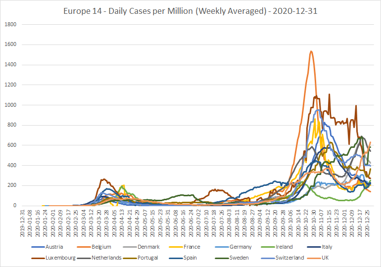
The main news this month, apart from seemingly never-ending lockdowns and the ghost of Christmas passed, has been the new, supposedly more easily transmissible strain of the virus, discovered in the UK. Initially, I was a bit skeptical. But as you can see in the graph at the top, the UK (pink line) does indeed have a climbing trend in new daily cases, which over the whole of December is very different from the trends in the other countries. So, I think we can fairly say that there is indeed a new, more transmissible strain, in the UK and perhaps some other countries.
In other news, no sooner had I changed all my “magic spreadsheets” to use the newly added reproduction rate (Rt) data column, than all 14 countries stopped reporting this data! There has been no Rt data for any of them since December 4th. I had already noticed that the Rt looked as if it was being calculated differently in different countries. So, perhaps they got together and decided the Rt values weren’t fit for purpose. A great pity, since it is (would be) one of the most interesting statistics of all at the present stage of the epidemic. It will be interesting to see whether, and if so when, they resume providing this data.
Cases
I’ll begin with cases again. I’ll skip the total cases per million graph, as it doesn’t show anything significant, which you can’t already see from the daily cases per million graph above.
Here is the list of daily cases per million as at the end of the month:

The UK, Sweden, Netherlands and Denmark are leading the pack. And every country except Belgium is now above the WHO’s “naughty boy, you mustn’t unlock” threshold of 200 new cases per million population per day. Yet many of the countries are under more severe lockdown than they were a month ago. This suggests to me that the WHO’s threshold is too low for its apparent purpose. Making me think, might it have been better to base any assessment of “high risk” status on hospital occupancy figures, rather than simply on cases?
Here’s the weekly case growth graph:

Ireland is now at the top in weekly case growth, suggesting that it too may have a more transmissible strain of the virus. The UK is second. The next group seem to be a mixture. Some have weekly case growth negative and roughly static. Others have recently turned a corner back towards, and in some cases even into, positive case growth. I wonder if this may be a “Christmas effect?” Again, time will tell.
Here’s the histogram of who is where:

And the latest lockdown stringency graph:

The issues, which were causing the UK stringency not to include measures which were only in place in individual constituent countries, do appear to have been fixed. The ordering of the stringencies is also worth a look. I haven’t seen Germany up at the top before! And the stringent lockdown in the UK is clearly not succeeding at slowing the rise in new cases.

Tests
For tests, I’ll show the graph of cumulative tests per 100,000. This shows that, with the exception of Denmark in second place, none of the countries have in the last few weeks been greatly increasing their testing rates.

And here is the graph of cumulative cases per test over the course of the epidemic:
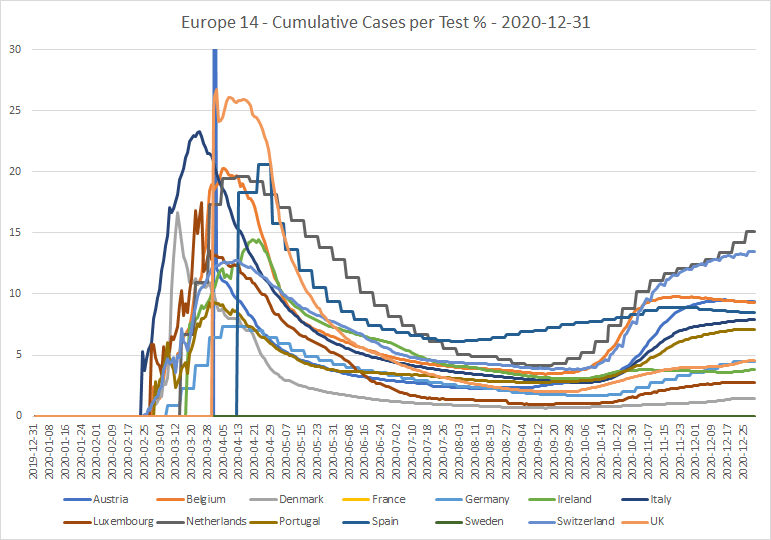
The countries divide into four groups. In the Netherlands, Switzerland and perhaps Germany, cumulative cases per test are still rising. In the UK, Ireland and Denmark, the rate, which had all but levelled off, started to rise again during December. In Belgium and Spain, the rate is now falling. The rest seem to be staying roughly constant.
Deaths
The daily deaths per million graph is inconclusive:

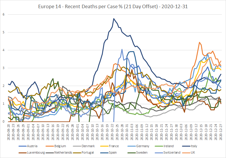
And the deaths per case, with a 21-day offset, tell us that several countries have had a bad December in this regard; most of all the UK, Belgium, Germany and France.

To conclude
I decided that, at this point, it isn’t worth reviewing again the effects of lockdown actions in individual countries since the beginning of December. One more month seems insufficient time to make any clear judgements, and the figures will have been distorted by Christmas (and will be further distorted by the New Year). I plan to take another look towards the end of January. By which time, I will hopefully be able to show also some data on hospitalizations and vaccinations.
Discover more from The Libertarian Alliance
Subscribe to get the latest posts sent to your email.
The much-vaunted ‘R’ number is, I believe, just computer modelling. In other words, a guess.
Hugo, the UK’s Rt values were certainly being modelled. I don’t know about other countries, but suspect the same. I think the problem is, not so much that the values are a guess, but that depending on the modeller’s (and funder’s) predilections, they may be either an informed guess or a politicized guess.
That’s why, in my previous missive, I plotted the values against weekly case growth, a proxy measurement, to see how good they were. In that particular race, the UK actually did better than anyone else.
Hi Neil – very comprehensive. For someone like me, with colour blindness, it proved difficult to untangle the spaghetti, but I got the gist.
It’s good to see the UK leading in so many ways – it must make our government very proud!
The new strain is proving a strain on our NHS. But it’s so good to have decisive action from a government that is always on the ball! Spike Milligan and his team are doing a great job.
I thought everyone with Labour was colour blind. Huh! Who knew?
Keep up the good work Neil. Ultimately what the TRUE DATA will reveal is that we are all being hosed. This whole subject has evolved into exactly the same dynamic as the climate debate.
Cutting through all this, what is the absolute mortality rate over the relevant period? My understanding is that since March 2020, it is something like 1200 in 100,000, which seems very ordinary to me. I don’t see the problem? Obviously a pandemic will put the NHS under great strain and everything that can be done should be done to mitigate this, but locking down an entire society and infringing people’s civil liberties is plainly a step too far and a grossly hysterical overreaction to, what for the overwhelming majority of infected people (I accept not all), is a very mild illness.
Tom, last I looked the reported mortality rate was significantly above previous years’ averages during April and May. And though it declined during the summer, it is once again above average. I haven’t looked into the detail on that, so I won’t try to make any judgements.
You’re right, locking everyone down is way over the top. But that’s what the politicians want! So, under the current system, that’s what they can do.
I am deliberately relying on the government’s statistics, to ensure the most cautious case possible, and here are the links I use:
https://www.ons.gov.uk/peoplepopulationandcommunity/healthandsocialcare/causesofdeath/articles/deathsinvolvingcovid19interactivemap/2020-06-12
https://www.ons.gov.uk/peoplepopulationandcommunity/birthsdeathsandmarriages/deaths/bulletins/monthlymortalityanalysisenglandandwales/november2020
In short, these links tell me that the mortality rates are nothing special and there is no lethal pandemic. It’s all just pack of lies.
Tom, the figures given in your second link do indeed tally with the graph I got from Our World in Data. About 15% above “average” mortality for the month of November, but within the range that is considered “normal” variability. My reading of it is that, while COVID is still a genuine problem, it isn’t as big a problem as the scaremongers like to make out. The question is though, how long will this above-average blip go on for?
Sorry but I disagree. I don’t believe it is a genuine problem. You have to look behind the statistics and ask how they are being compiled. If you look for instance at the monthly mortality rates, you will see that the basis of this is provisional death registrations, and it is implying that Covid is being attributed to cases where the deceased has died with a diagnosis of Covid and Covid is considered to be at least a secondary factor. Anybody can see that this opens the way for Covid to be attributable to deaths where SARS COV-2 is not the strict cause of death but the medical practitioner adds it to the death certificate anyway for completeness. Ordinary doctors are not pathologists.
The whole thing is fraud.