
COVID-19: Are the Vaccines Working?
By Neil Lock
I’ve been looking, for a few weeks now, for hard evidence that the COVID vaccines being rolled out in various countries are having an effect, or not as the case may be. I think there is probably enough data now to do at least a preliminary assessment. So, here goes.
The data I used for this report, both from Our World in Data and the Blavatnik School of Government, was taken on April 1st, and ran up to March 31st.
The most prolific vaccinators
My first question was: Which countries should I concentrate on for this exercise? To answer that, I first looked at the question: Which countries have fully vaccinated the most people per head of population so far? I did this on the basis that the more people per hundred have been fully vaccinated, the stronger the effect that should be visible if the vaccines are working, either to reduce case growth or to reduce deaths per case, or both.
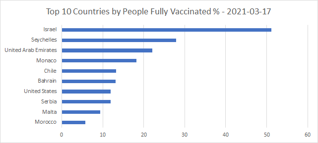
Since, so I hear, the vaccines all take about 2 weeks following the second jab to reach full effectiveness, I began by plotting which countries in the world had given the most two-jab (full) vaccinations per head of population as of 2 weeks before the cut-off date of my data. That is, March 17th. Here’s a graph of the top 10 as at that date:
That’s an interesting and varied list. Three in the Middle East, with populations ranging from about 2 million up to 10 million. One island country off East Africa, with population around 100,000. Two small countries in Western Europe, with populations around 40,000 and about 400,000. One South American country, with population a little under 20 million. One behemoth in North America. One Eastern European country, a little under the 10 million mark. And one in North Africa, with the second biggest population on the list, about 37 million.
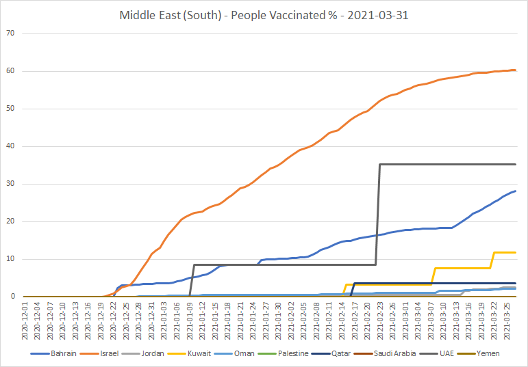
I also looked for the top 10 countries by people vaccinated per hundred, using the same date, March 17th, for my figures. If you subtract the numbers in the first list from these ones, you get the percentages of people who have had one jab but not two.

Two countries in this list, the UK and San Marino, were not in the first list. It looks as though both have taken a strategy of getting the first jab out as widely as possible, then leaving a considerable gap before the second.
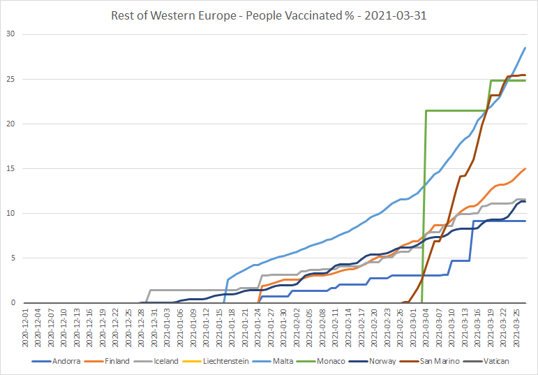
I’ll show the graphs of total vaccinations by date, for the European and Middle Eastern countries in the lists. Here’s the region which contains Israel, the UAE and Bahrain:
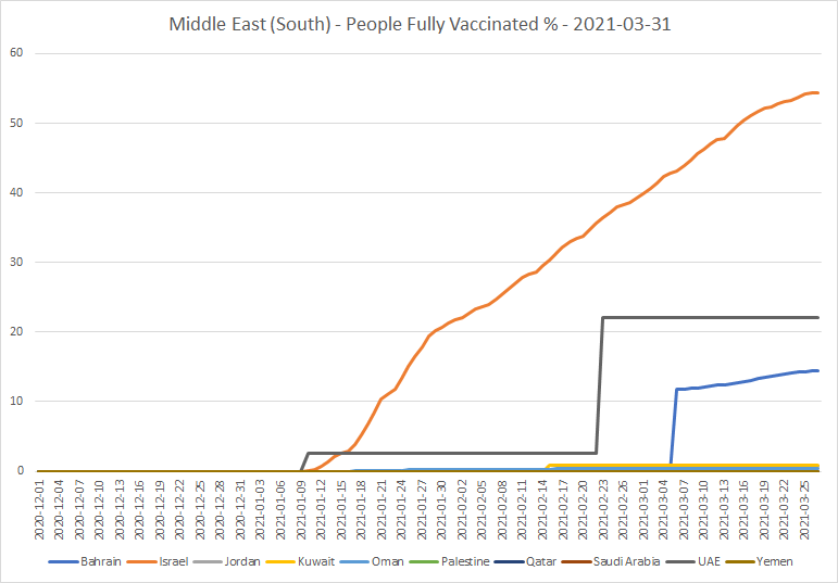
Only Bahrain and Israel are reporting numbers vaccinated on a regular basis. It may well be, therefore, that the UAE have actually done quite a few more vaccinations than they have so far reported.
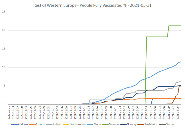
Here’s the region which contains Monaco, Malta and San Marino. The last has a population comparable with Monaco’s. And is notable as the second hardest hit country in the world (after the Czech Republic), with almost 1 in 400 of its population having died of COVID.
And I can’t resist showing the graph of people vaccinated per hundred for the region which includes the UK and the core of Europe:
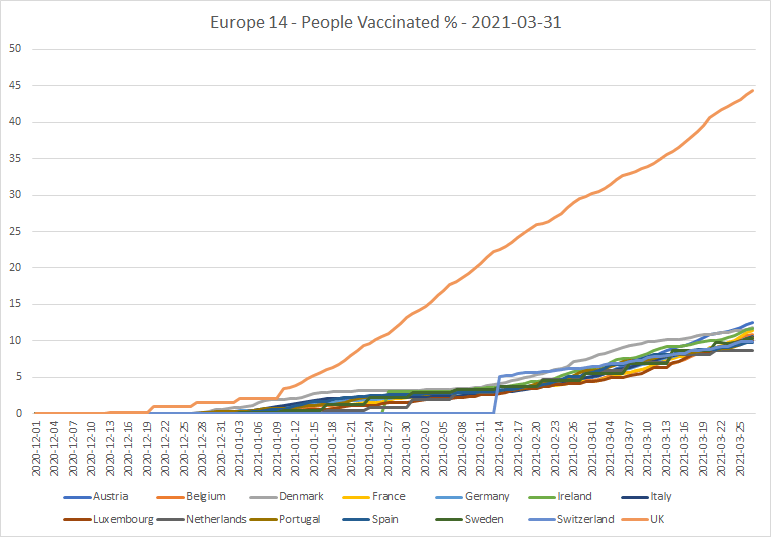
That graph doesn’t half make this Brexiteer laugh! So much for the EU and their centralized procurement policy.
So, now I’ll look at a selection of the countries in turn; starting at the top of the first list.
Israel
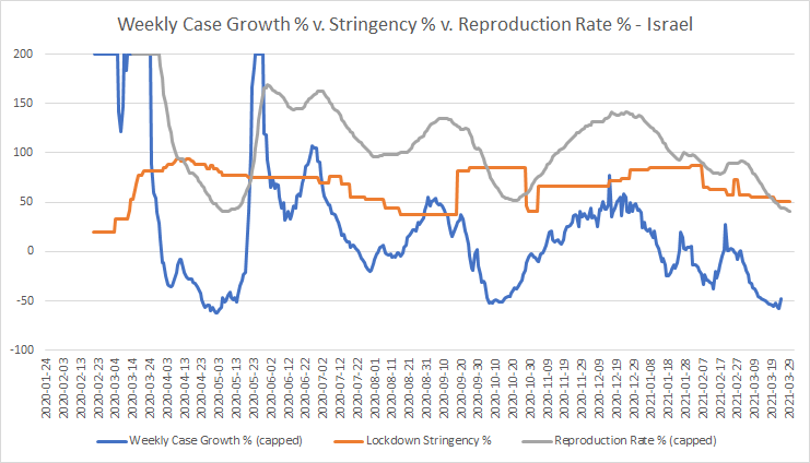
Here’s the overall profile of the Israeli epidemic:
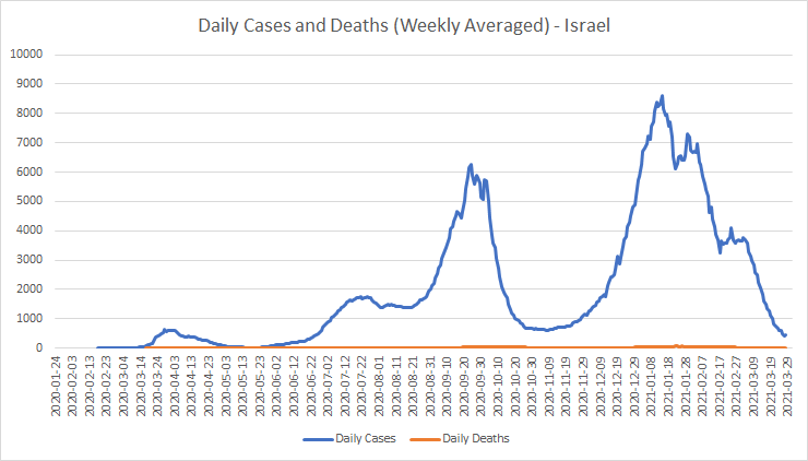
Things weren’t looking too good at the New Year; but since then, the performance looks impressive. Let’s see how much of a contribution might have been made by lockdowns:

During January, lockdowns may have made a difference. But since early February, the Israelis have been unlocking fairly steadily. Here’s what they have done:
| Date | Stringency | Measures |
| 20201227 | 82.41 | Workplaces: Mandatory closed Stay at home: Required with exceptions Travel: Mandatory restrictions |
| 20210107 | 85.19 | Gatherings: Up to <=10 |
| 20210131 | 87.04 | Schools: Some closed |
| 20210207 | 64.81 | Workplaces: Some closed Stay at home: No measures Travel: No restrictions |
| 20210211 | 62.96 | Schools: Some closed (Regional) |
| 20210221 | 57.41 | Events: Recommended cancelled |
| 20210225 | 73.15 | Workplaces: Mandatory closed (Regional) Stay at home: Required with exceptions (Regional) Travel: Mandatory restrictions (Regional) |
| 20210228 | 57.41 | Workplaces: Some closed Stay at home: No measures Travel: No restrictions |
| 20210307 | 54.63 | Gatherings: Up to 11-100 |
| 20210321 | 50.93 | Workplaces: Recommended closed |
There’s still a lot of unlocking to do. But the R-rate has been below 1 since the middle of January, and the (negative) weekly case growth is now down to levels not seen since May of last year. It looks, at first sight at least, as though fully vaccinating only around 20% of the population was enough to bring R-rate and case growth tumbling down from mid-February onwards. And now that number is up to around 50%, they are still well down, despite the unlocks. That’s encouraging.
All this suggests a possibility that having 50% or so of the population fully vaccinated may push the whole population over the herd immunity threshold. Time, and experience in other countries, will tell whether that is the case.
And here are the daily deaths per case (with a 21-day offset):

Deaths per case are now lower even than at the previous low back in October. And they have been going down all but continuously since the start of the vaccination program around Christmas. Again, encouraging.
The Seychelles
The Seychelles are in a rather different situation from Israel. Here’s their epidemic profile:
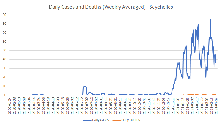
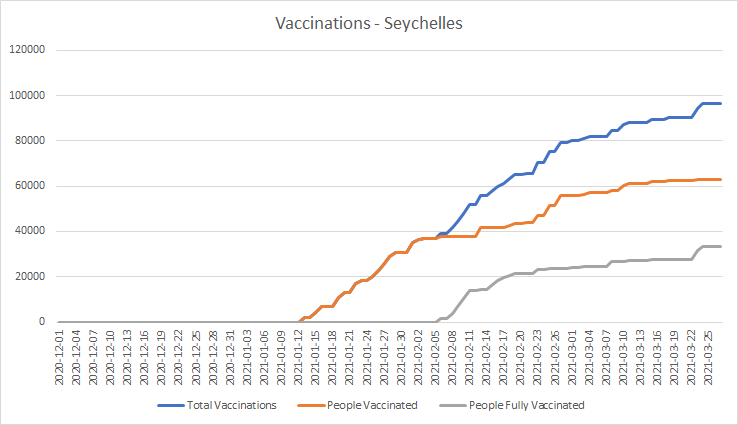
So, the Seychelles had got off quite lightly, until they were hit by a big wave of cases starting just before Christmas. Here are their vaccinations:
Here are the R-rates, weekly case growths and lockdowns:
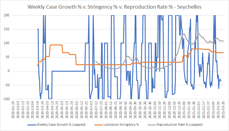
Because of the small population, weekly case growth here tends to be volatile. The R-rate is still above 1, but isn’t rising as you might have expected it to do, given some recent unlocking activity:
| Date | Stringency | Measures |
| 20210114 | 49.07 | International: Screening |
| 20210118 | 63.89 | Workplaces: Mandatory closed Travel: Mandatory restrictions Face covering: Required when with others |
| 20210123 | 79.63 | Schools: Mandatory closed Gatherings: Up to <=10 |
| 20210126 | 79.63 | Travel: Recommended not to travel International: Ban some arrivals |
| 20210129 | 79.63 | Face covering: Recommended |
| 20210215 | 78.7 | Workplaces: Some closed Events: Mandatory cancelled Face covering: Required in some places |
| 20210301 | 75 | Stay at home: Recommended |
| 20210304 | 69.44 | International: Screening |
| 20210315 | 65.74 | Schools: Some closed Testing: Open Face covering: Required when with others |
Clearly, there’s still a very long way to go. The deaths per case graph is inconclusive, though again, this figure is always likely to be volatile because of the small population:
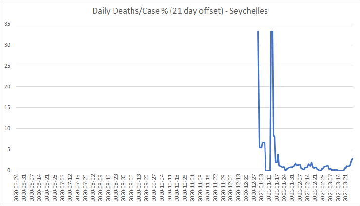
We’ll have to wait and see what happens to that up-tick at the right-hand end.
The UAE
Here is the cases and deaths graph for the United Arab Emirates:

This is not unlike the Israeli profile; again, the after-Christmas peak was the big one. They have fully vaccinated less than half as many people per hundred as Israel; but they are also doing well in the first-jab stakes. And, as I said earlier, their late reporting may understate the progress of their vaccination program.
Here are the R-rates, stringencies and weekly case growths:
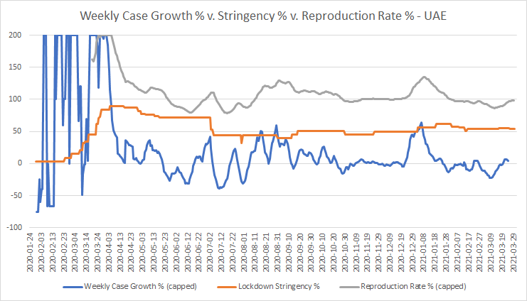
The R-rate is keeping just about under 1, and the weekly case growth is now negative most, but not all, of the time. Here is their recent lockdown and unlock activity:
| Date | Stringency | Measures |
| 20210103 | 56.48 | Schools: Mandatory closed |
| 20210119 | 62.04 | Travel: Mandatory restrictions (Regional) |
| 20210126 | 62.04 | Schools: Mandatory closed (Regional) Workplaces: Some closed (Regional) |
| 20210202 | 57.87 | Events: Mandatory cancelled (Regional) Gatherings: Up to <=10 (Regional) |
| 20210209 | 56.48 | Gatherings: Up to <=10 International: Screening |
| 20210214 | 50.93 | Schools: Recommended closed |
| 20210216 | 53.7 | International: Quarantine high-risk |
| 20210316 | 55.56 | Schools: Some closed (Regional) |
| 20210326 | 53.7 | Schools: Recommended closed |
Almost all of these measures have either been regional, or affected only international travel or schools. From the point of view of the general population, the lockdown level has been roughly constant through most of the period. Workplaces are recommended closed, but that probably means that few if any of them are actually closing.
Is the percentage vaccinated in the UAE already sufficient to “turn the corner” and keep cases on a strong downward course, as has happened in Israel? It looks to me as if it’s not very far away from that knife-edge, but not there yet.
As to deaths per case, these have been unusually low in the UAE, compared with most other countries. This could well have been due to a very thorough testing program; the average person has been tested more than 3 times! Strong track and trace systems may also have had something to do with it, though these do have major negative implications for privacy.
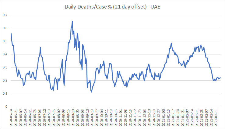
That drop since late February, if it is maintained, could prove to be evidence that the vaccine gives effective protection even for those whom it didn’t prevent from catching the disease.
Monaco
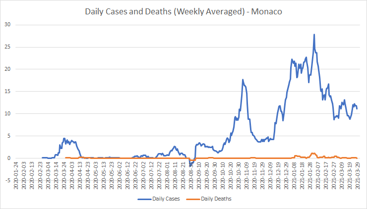
Monaco is extremely small (about 2 square kilometres), and is the most densely populated country in the world. As of March 17th, they had fully vaccinated just under 20 per cent of the population. Here’s the graph of daily cases and deaths:
And here are the R-rates, stringencies and weekly case growths:
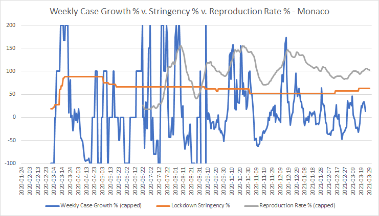
Now, that’s a bit odd. Even though the vaccination program has been going quite well, the R-rate started increasing again in late February, so it is now back above 1. And despite the downward trend in the peaks of weekly case growth, new cases are still oscillating rather than starting to drop off significantly. Even though the trend over the last month and a half has been, not towards unlocking, but towards locking down further!
| Date | Stringency | Measures |
| 20210208 | 51.85 | Testing: If symptoms |
| 20210215 | 57.41 | Events: Mandatory cancelled |
| 20210316 | 62.96 | Workplaces: Mandatory closed Events: Recommended cancelled Stay at home: Recommended Travel: Mandatory restrictions Testing: Open |
Closing all workplaces and bringing in mandatory restrictions on travel, when cases are on an irregular but generally downward trend, and almost 20% of the population have been fully vaccinated, suggests to me that the Monégasques may not have as much confidence in the vaccine(s) as the Israelis, the Seychellois and the Emiratis seem to.
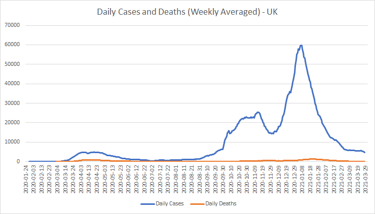
The UK
I didn’t think it was worth wading through detail for countries with less than 15 per cent of the population fully vaccinated so far. But there’s one more country of particular interest: the UK. The “septic isle,” as I like to call it. But I’ll accept “skeptic isle” or even “sceptic isle!”
The strategy here has been to get the first jab out as quickly as possible, while holding back the second. I’ve heard a claim that a single jab is 73% as effective as the two together. If that is so, then 38% partly vaccinated should give equivalent protection to 28% fully vaccinated. That ought to mean, less effect visible than in Israel, but comparable with the UAE and the Seychelles.
Here is the daily cases and deaths graph throughout the epidemic:
And here are the R-rates, lockdown stringencies and weekly case growths:

Those “unlocks” in the last few weeks are hardly worth the name! Here they are, for England which has 84% of the UK population:
| Date | Stringency | Measures |
| 20201226 | 74.07 | Gatherings: Up to <=10 |
| 20210105 | 87.96 | Schools: Mandatory closed Workplaces: Mandatory closed Stay at home: Required with exceptions Travel: Mandatory restrictions |
| 20210308 | 80.56 | Schools: Recommended closed |
Apart from the schools, the whole of England has been under full lockdown for three months without a break, and most of us for five full months without a break. Back in October, we had a reasonably sane “tiered lockdown” system, which seemed to be starting to solve the problem. But the lockdown Nazis won out, both in November and in the new year; and no-one who has suffered unnecessarily should ever forgive Johnson or the Tories for letting that happen.
But there’s what looks like some good news. The R-rate has been below 1 since the middle of January, and weekly case growth has been negative pretty much continuously since the new year. And when the schools re-opened, new cases were static for a while, but in the last week seem to have started going down again. Could this be, at least in part, down to the vaccine, and not entirely due to the lockdown? Of the other countries I’ve looked at here, the one whose track the UK seems to be following most closely is the UAE. This despite the fact that the UAE has consistently been locked down far less severely than the UK.
And it’s possible, even, that the vaccine manufacturers’ claim on the effectiveness of a single jab may actually turn out to have some verisimilitude. We will know more after the shops finally re-open, scheduled for 10 days’ time.
All this being said, there is one other piece of potential good news, the deaths per case ratio:

That long downward trend, which seems to have begun in about the second week of January, reminds me very much of the corresponding graph for Israel. Daily deaths per case are now close to their previous all-time low of last August. Even if it did turn out that the vaccines don’t actually do much to stop transmission of the disease once the lockdowns are removed, at least we may see the thing becoming less likely to kill us if we do get it.
Some concluding thoughts
And not entirely nice ones.
In places with slower vaccine roll-out, such as Eastern Europe, France, Germany and Italy, the virus is going berserk yet again. So, I cannot, as yet, definitively separate the effects against the virus from vaccines from those caused by lockdowns. Much will become clearer in the next month or so.
But there are other aspects to contemplate. First, will those countries which unlock “just in time” for vaccines to prove effective, or herd immunity to be reached, be able to re-build their economies better and faster than those that have subjected their people to the “lockdown fever” of political élites that care nothing at all for the people they are supposed to serve?
And second, will the psychopathic buffoons that currently think they are in charge in the UK go ahead – as they seem to be determined to – with restricting the liberties of those of us who choose not to take the vaccine? Even though, in the Westminster Hall parliamentary debate on the subject on March 15th, every speaker was against any such scheme within the UK?
This seems, to me, to be very much like a switch-hit at repeating what Hitler did to the Jews. But this time round, it’s those who don’t wear the yellow star who will be persecuted. This is altogether too close for comfort to the biblical “mark of the beast,” without which no-one is to be allowed to buy or sell. And I’m sure I’m not the only person who has noticed.
Discover more from The Libertarian Alliance
Subscribe to get the latest posts sent to your email.
Is there any precedent for a new vaccine to be brought out and used in the middle of a pandemic, with the entire population effectively being used as test subjects (i.e. controlled and non-controlled)? I wonder how doing so may effect distribution and transmission of the virus and whether it would still follow the pattern I would expect for the natural community life cycle of a virus: i.e. a bell-curve type pattern, based on negative feedback.
I know that during the Birmingham smallpox outbreak of 1978, vaccination was used, but that was very different in that it was a local outbreak, not a pandemic, the vaccine was tried-and-tested and widely considered efficacious and safe, and most who accepted the vaccine were presumed to have been vaccinated before.
I would need to see the UK graphs over a longer X-axis (timespan) to make any sense of them. Even a few months seems to me only to represent a snapshot and it is difficult to come to many conclusions. The first graph appears comparing case and death rates shows a subtle correlation between the two, but that is not necessarily a surprise as prior to 2021, most testing was among the at-risk concentrated group.
The last graph shows a downward trend, but there would be a downward trend anyway as the said at-risk group are unlikely to be re-tested once vaccinated. The issue is that ‘cases’ are being conflated with manifest infection, and the case rate is totally fictitious anyway as it is based on a deeply flawed (perhaps fraudulent) testing process. A comparison of case and death rates is therefore not much help and case rates in my view tell us nothing since they are politically-driven and the tests will produce the results that policy-makers want.
This was always an elderly person’s disease, with some penetration into that part of the younger population who are unhealthy or immunocompromised. Thus, generalised lockdowns were unnecessary but seem to have been justified on the basis that limiting virus transmission in the community-at-large would assist efforts to protect those most at-risk, but no consideration seems to have been given to the harms that would result from such over-the-top measures. One point your middle graph makes very well is that the lockdowns have not even been effective at stopping cases, though the caveat emptor is what I saw above about the flaws in evaluating anything based on case rates.
Tom,
You ask, is there a precedent of a new, untried vaccine being rolled out on the scale of millions? I don’t know of one. The only comparable case I know of was the 1976 swine flu vaccination program in the USA: https://www.bbc.com/future/article/20200918-the-fiasco-of-the-us-swine-flu-affair-of-1976. In that case, the vaccines were not untried, but they had to be tweaked for each new flu variant, including the 1976 swine flu. And they had never been rolled out on a scale up to the millions before.
In that case, the “cure” of mass vaccination certainly was worse than the disease. In this case, it’s not clear yet – which is exactly why I have been doing this research. But, back in December, the UK government gave immunity to the vaccine manufacturers against claims arising from effects of their vaccines. Not indemnity – which means that, if a case is proven, the government picks up the tab – but immunity, which means the injured parties have no legal recourse at all. That was the moment at which I, personally, decided I wasn’t going to take the vaccine.
It’s also a reason why, if Johnson does go ahead with his passport schemes (https://news.sky.com/story/covid-19-what-are-vaccine-passports-and-how-might-they-work-in-the-uk-12265384), it is likely to lead to a LOT of ructions. And most of all, if it gets extended in the future to pubs, restaurants and “non-essential” shops – a possibility about which the article is unclear. The petition against the passport scheme (https://petition.parliament.uk/petitions/569957) has gathered more than 320,000 signatures, and it’s still going, despite having been debated by MPs in Westminster Hall on March 15th, and no-one there having spoken for the idea.
There certainly is a correlation between case rates and death rates. There is a particular distribution (log-normal) which virologists expect the time lapse between first symptoms, and death if it eventuates, to follow. And it does appear to follow that distribution, with a mean of about 21 days. That is why I use a 21-day offset between case date and date of death in the final graph. Unfortunately, the distribution has a very high standard deviation, because a small but significant proportion of people “hang on” in hospital for weeks or even months before finally succumbing to the disease. Because of this, the deaths-per-case rate offset by 21 days will inevitably go up and down. I’m actually surprised it’s as smooth as it is.
I understand your concern about case rates being inaccurate, but we can still monitor deaths-per-case as long as the technology used to assess the cases is not changed. “Case inflation” was a problem last summer as the tests were rolled out, but I don’t think that’s so much of an issue now.
As to lockdowns, yes, a 3-month continuous national lockdown is not just unnecessary, but seems to have been done out of pure spite. It is madness to lock down people in Devon because there are outbreaks of the virus in, say, Essex. Interestingly, there was a map of cases by area published here: https://electionmaps.uk/covid19-tier-map. But they stopped updating it after February 16th – at exactly the moment when those like me who look at such things would have said, “We’re back to Tier I case levels now in my part of the world, so why aren’t we unlocking?”
Thanks – I may not now have time to respond, but have read your comment and will consider/think about it further.
By the way, I gave your piece the usual five stars. Not sure why somebody would award it less. Maybe we’re being watched?
No Tom, what seems to be happening is that there’s someone not well disposed to us, who likes to get in first and award one star. Whoever it is, has done it to me twice now, and to Duncan Whitmore as well. The site management is a little disorganized at the moment; Keir is teaching in France, and Sean doesn’t have time to do much. This, too, shall pass.