By Neil Lock
I confess that I haven’t been looking too hard at the COVID situation in the last few months. Despite dire cries from the usual suspects like “you’d better get jabbed (again) now,” the UK has been bumbling along at a relatively low rate of new cases for more than six months. But hearing that there had been a recent surge in new cases in Austria and Germany in particular, I thought I would take one more cut at the data for my core 14 European countries.
Country Ratings
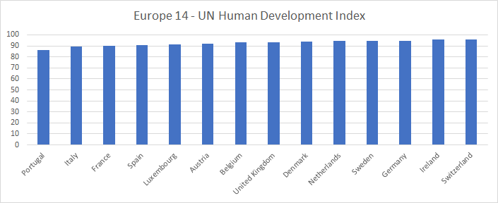
As part of a recent re-working, I have updated the values of two country ratings I use (UN human development index and Freedom House rating) for all countries to the 2021 figures. Here are the graphs of those ratings:
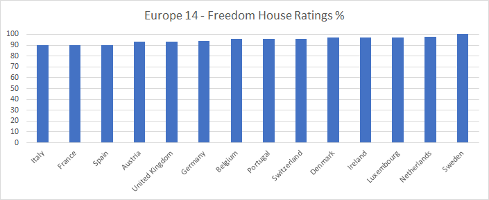
It’s worth noting that many Freedom House ratings world-wide have gone down substantially during the period of the COVID epidemic. The UK is one example. It is my view that that rating should have been marked down by a lot more than it has been!
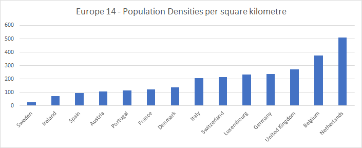
I have also imported corrected population and population density figures from Our World in Data. (The UK population, for example, was previously being shown as above 68 million, whereas now it shows at about 67.3 million, a more believable figure). Here are the populations and densities:

Timeliness of the data
I initially took the data for this exercise from Our World in Data and the Blavatnik School of Government on October 12th, 2022. That data ran up to October 11th. It did not show as clear a picture as I had hoped of whether the latest wave of the epidemic was finally subsiding in the region or not. I therefore took the data again on October 21st, after all the countries had provided at least a week of further data. This data runs up to Thursday October 20th.
One difficulty in analyzing the data at this stage in the epidemic is that, in contrast to earlier, not every country is now reporting data every day, or anything like it. My first task, therefore, was to develop some new bar charts to give a picture of how timely the data is from each country. Here is this chart for new cases:
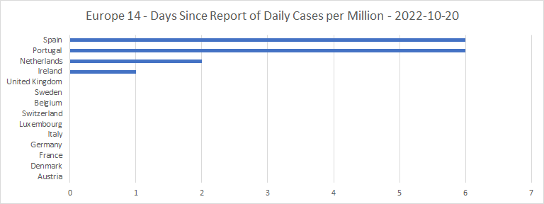
Ireland, the UK, Sweden and Switzerland are now all reporting new cases on a weekly cycle. Belgium and the Netherlands are reporting twice weekly. Spain was reporting twice weekly up to early October, but recently seems to have dropped into a weekly cycle. Luxembourg’s reporting cycle is irregular, but they seem to be reporting three to five times each week. Denmark, France, Germany and Portugal are all reporting on weekdays only. Austria and Italy are still reporting every single day. There seems to be a roughly even divide between those countries still reporting new cases at least every other day, and those taking a more relaxed attitude to their statistics.
Cases
Here are the spaghetti graph and bar chart for the total cases per million:
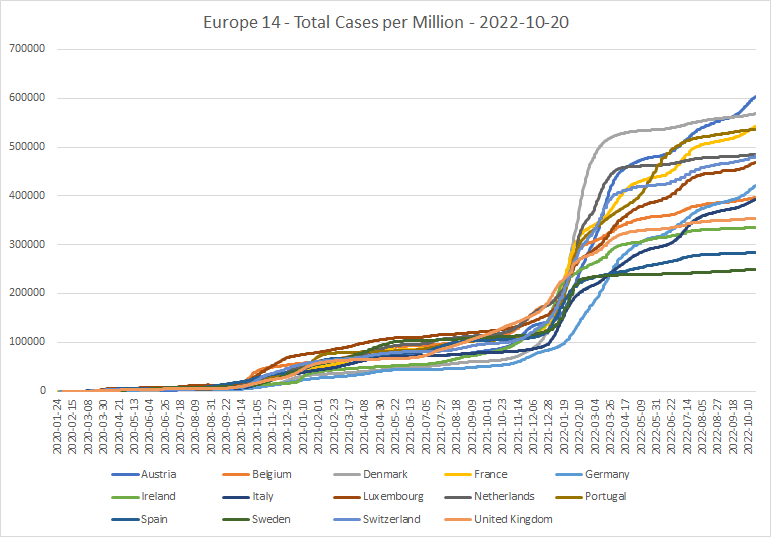

The large wiggles in the data from several countries in recent months, I found a bit unexpected. Austria has now overtaken Denmark at the top of the cases per million league, with 60% of the population having been diagnosed as cases. And Germany has moved from being last by a long way back in March to a mid-table position today.
This does, of course, beg the question of just how good the historical case count data is for each country. In Italy, Sweden and the UK at least, it seems clear that a lot of COVID cases in the early part of the epidemic were missed (including my own), because there were no tests available for those who weren’t ill enough to need hospitalization. And this may well apply to Belgium, Ireland, and Spain as well.
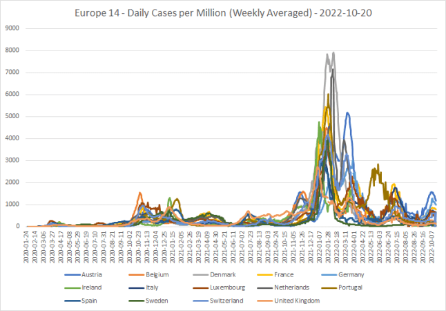
Here is the same data looked at in terms of new daily cases per million:
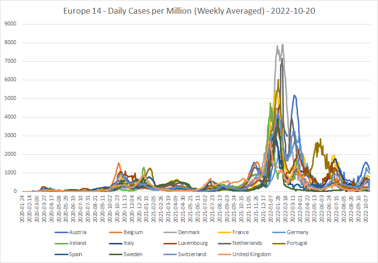
The top four, at least, have seen in recent weeks a strong increase in new cases. These would appear to be due to a spread of new omicron sub-variants, notably BA.4.6. But all these countries seem now to be getting “over the hump” of new cases.
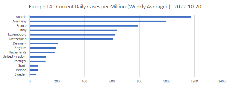
Weekly case growth percentages currently are as follows. For comparison, the October 11th graph is shown immediately after:
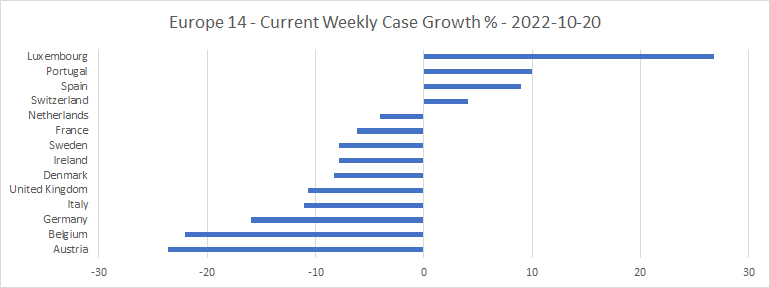
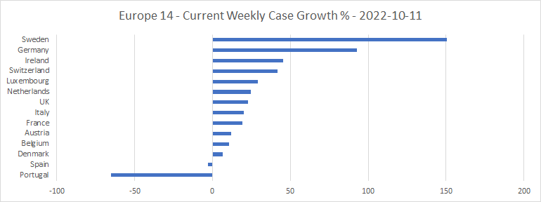
As the spaghetti graph shows, and the difference between the weekly case growths confirms, most of the countries have now passed the peak of the latest wave of new cases, which presumably has been caused by omicron variant BA.4.6. The Spanish and Portuguese data do look a little bit odd (maybe the reports from a week or so ago were understated?) But none of those weekly case growth percentages in the top chart looks too concerning.
Public Information Campaigns
Each country has kept up a “public information” campaign throughout the epidemic. For most of the time, this has been continuous and co-ordinated fear propaganda (100% on the “stringency” scale). But recently, two of the countries (the UK and Switzerland) have downgraded the status to “urging caution,” and Sweden has stopped its campaign altogether. They obviously don’t feel COVID is a big threat any more:
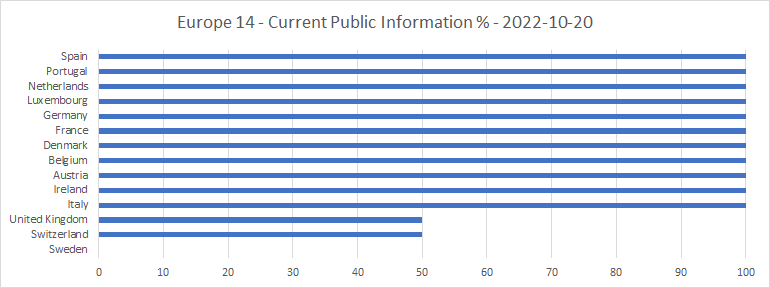
Italy also had downgraded its campaign to “urging caution,” but has now ramped it up again.
Lockdowns
Here is the bar chart of how recently lockdown status has been provided by each country:

This seems to show two interconnected things. One, that reporting of lockdown status can be quite slow. Two, that lockdown levels in many of the countries have been stable for some time.
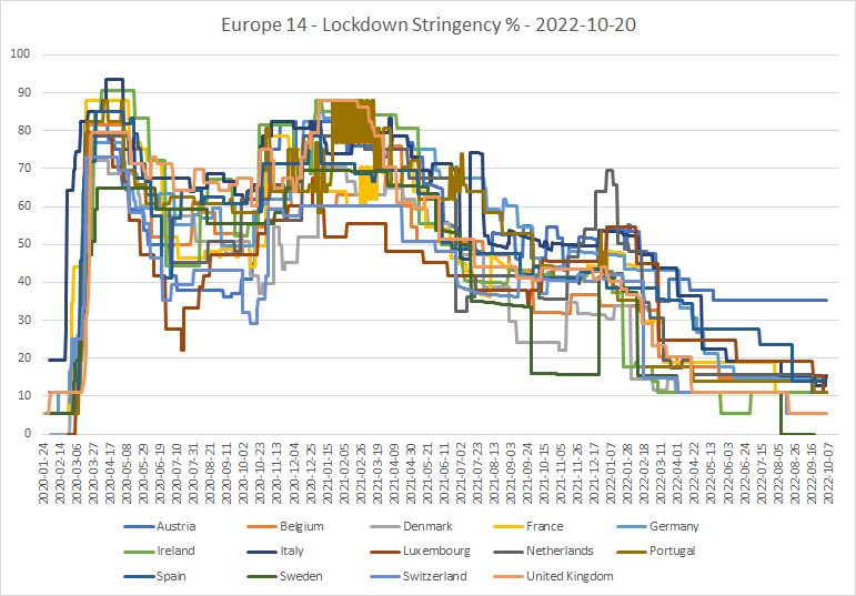
Here is the spaghetti graph of lockdown stringencies, which shows that with the notable exception of Austria, most have been on a downward trend for many months:
The current lockdown stringencies are as follows:
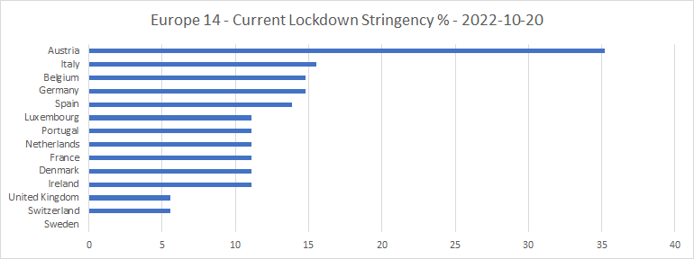
Sweden is now all the way down to zero stringency. Maybe the reason they aren’t bothering to report stringency data any more is that they think their lockdowns are over for good!
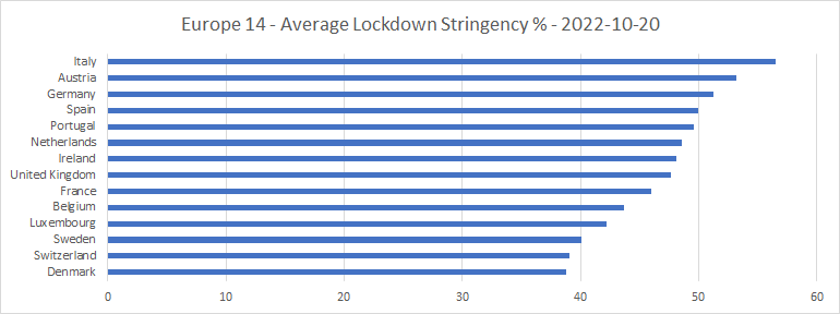
And here are the average lockdown stringencies (counted day by day) over the course of the whole epidemic:
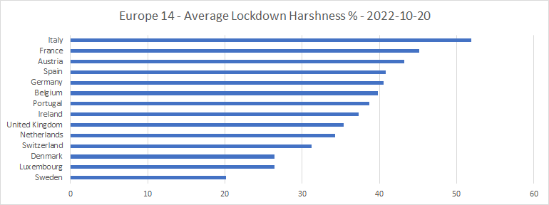
Here is the same data expressed in terms of my “harshness” metric, which assesses the subjective nastiness of lockdown mandates, including face masks, to the people under them:
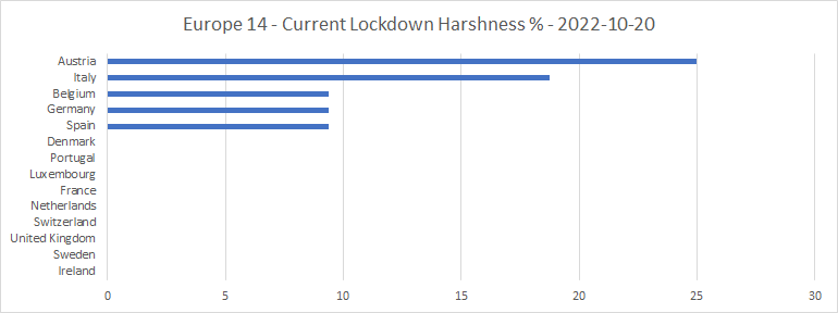
Austria is now locked down far harder than the rest, having been the slowest to unlock of all these countries. Its mandates are: Schools: Some closed (Regional), Workplaces: Some closed, Gatherings: Up to 101-1000, Face covering: Required in some places. Italy has been steadily reducing lockdowns over the last several months, but still has: Workplaces: Some closed, Face covering: Required in some places.
Belgium has had only one mandate, since late May: Face covering: Required in some places. Though it is still recommending closure of workplaces. Germany has had the same mandate since the middle of June, as has Spain since late August. And Denmark, having had no face covering mandate since late March, re-imposed “required in some places” on 20th August, then scrapped it again on 17th September. The remaining countries have no COVID mandates at all, of any kind.
Here are the current levels of face mask rules:
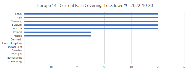
50% represents “required in some places” and 25% “recommended.”
Hospitalizations
Here’s the timeliness bar chart for COVID hospital occupancies:
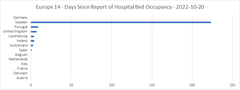
All the countries have reported on hospital occupancy at some point within the last 2 weeks, except for Germany, which has never provided this data, and Sweden which has not provided any hospital occupancy data since March. I have, therefore, removed these two countries from the chart of percentage of available hospital beds occupied by COVID patients:
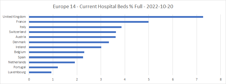
The UK and France, two of the countries now seemingly among the most relaxed about lockdowns, lead. But as their new cases are now going down, there is little cause for alarm.
Here is the spaghetti graph of hospital occupancies by COVID patients over time, and the bar chart of weekly hospital occupancy growth:
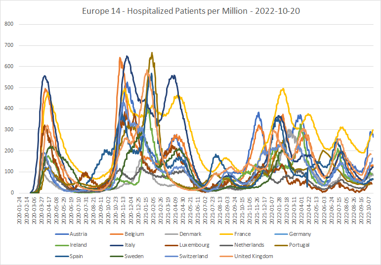
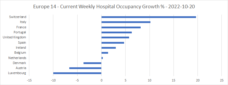
COVID hospitalization levels in France and Austria, at least, were closing in on values as high as they have been since omicron first arrived in late 2021. But Austria has now passed its peak of hospital occupancy, and many of the other countries seem to be close to levelling out. Again, I have removed Germany and Sweden from the hospital occupancy growth chart.
Intensive Care Units
Here’s the timeliness bar chart for ICUs:
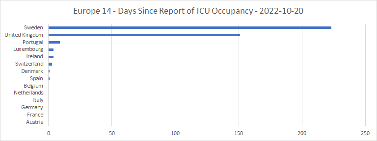
Sweden, again, has not seen fit to supply any data since March. And the UK has not supplied any since late May. Both, presumably, feel that ICU capacity for COVID patients is unlikely to be a problem again, however oversubscribed it was early in the epidemic. So, I have taken these two countries out of the list of ICU occupancies with COVID patients:
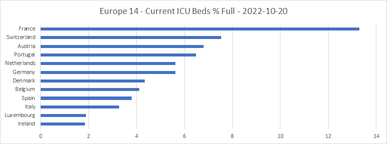
Even in France, these numbers are tiny compared with their values at the 2020 peak of the epidemic, or even around the new year of 2022. As is shown by the spaghetti graph of ICU occupancy:
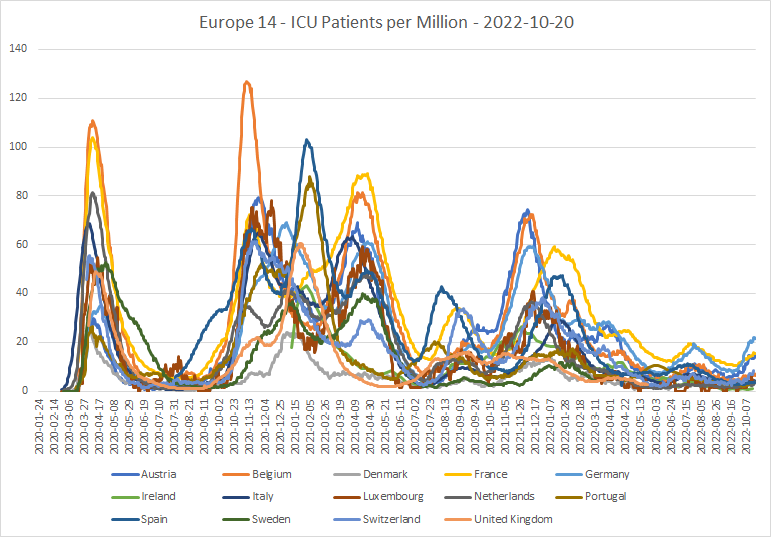
This shows a generally declining trend over the course of almost a year. Nevertheless, there has been an upturn in ICU occupancy by COVID patients in recent weeks, particularly in Germany, Austria and France. And this upturn has happened, albeit far more slowly, in the other countries as well. Again, since in most countries new cases are now starting to drop, and hospital occupancy to level out, there should be no great cause for concern.
Deaths
Here’s the timeliness chart for reports of COVID deaths:
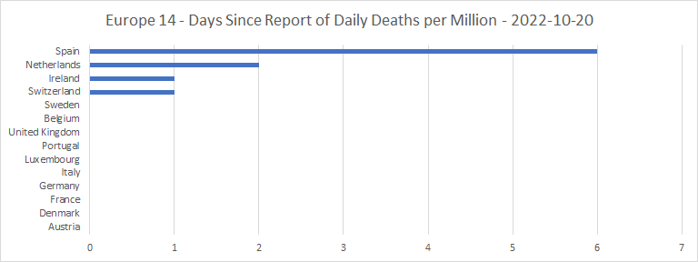
Mostly, the countries which report cases weekly are also reporting deaths weekly. The UK has been an exception, as in the October 11th data it reported zero figures for almost the whole of the previous three weeks. At the moment, the UK appears to be providing a total of COVID deaths for the month so far, then assigning them to individual days later.
Here are the total deaths per million spaghetti graph and bar chart:
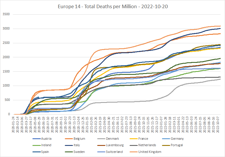
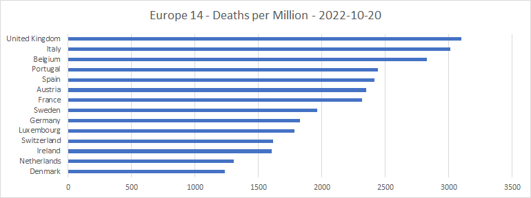
It looks as if the UK has completely re-calculated its deaths-from-COVID figures throughout the course of the epidemic, and they are now higher than any of the other countries in the group. The two big peaks of COVID deaths have been adjusted upwards; something which is not shown by other data sources such as Worldometers. Nor, even, by the UK government’s own dashboard, which is showing raw figures of 977 deaths per day at the first peak in April 2020 and 1,179 at the second in January 2021, as against 1,461 and 1,490 in the feed from Our World in Data! These are very significant adjustments, which seem to have been made some time between mid-August and mid-September 2022. This may help to explain why the UK is now often reporting zeroes for recent days; perhaps they are taking extra time and precautions to make sure that they get the data right in the end? But it’s still odd that even the UK government’s own dashboard doesn’t show these adjustments.
Here’s the spaghetti graph of daily deaths per million:
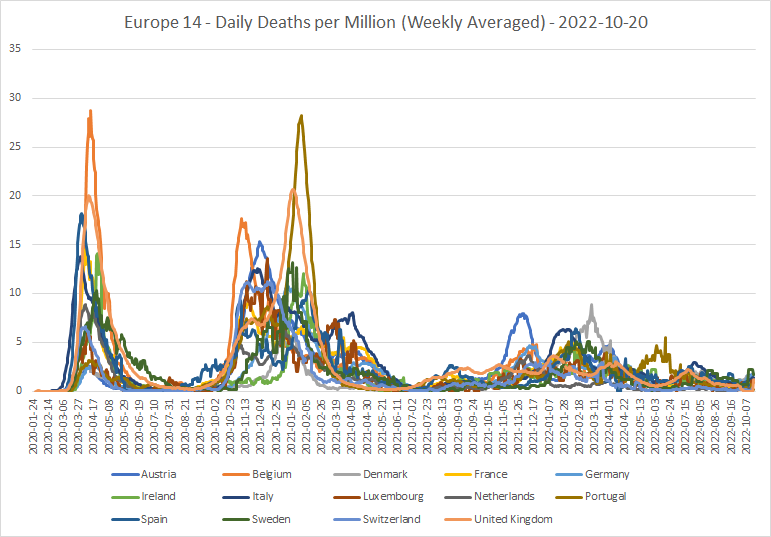
The apparent bumps at the end are caused mainly by the vagaries of reporting in Sweden and the UK. Otherwise, there’s what looks like good news here; the daily numbers of deaths in all or most of these countries have been tending downwards for many months. So perhaps the latest wave isn’t any more lethal than its predecessors, despite increasing hospitalizations in some countries?
Another way to look at the COVID deaths data is by cumulative deaths per case:
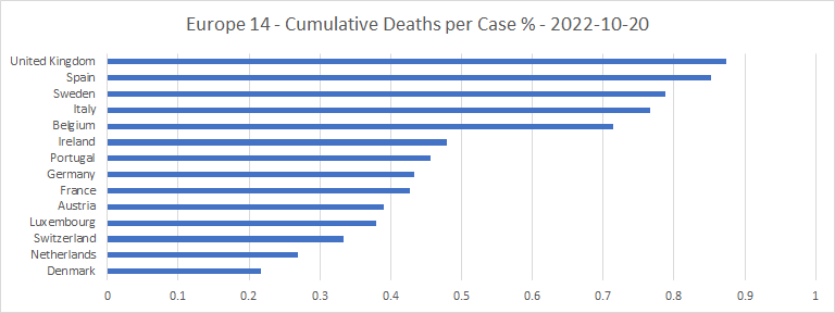
The UK and Spain are the two worst on this metric, by some way. In the UK, that may have something to do with being relatively good at counting COVID deaths (since the recent changes), but not so strong on counting COVID cases. But even so, the numbers say something not nice about the NHS and its Spanish equivalent. Denmark and the Netherlands are at the opposite end of the scale.
Another way to cross-check the deaths figures is to show excess mortality. But different countries report excess mortality data at widely differing rates:

Except for Ireland, they all report on the same day of the week! But it looks as if the non-Catholic countries, except Sweden, try to report excess mortality for each week within a month or so. But data for the Catholic countries and Sweden may be out of date by longer. Italy seems to have particular difficulty providing up-to-date excess mortality figures.
Here are the spaghetti graph and bar chart of the average of excess mortalities (relative to the base period of 2015-2019) throughout the epidemic:
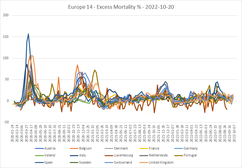
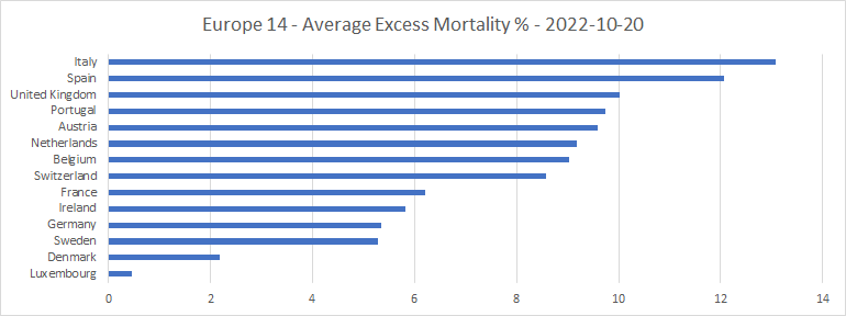
That looks to me as if excess mortalities in the region troughed in early 2021, presumably because COVID had picked off during 2020 a significant number of those who might have been described as “low hanging fruit.” Since then, if anything, the trend in excess mortality until very recently has been upwards, except for a sudden drop around New Year 2022. This is a bit odd, considering that deaths explicitly attributed to COVID have been generally falling over the course of 2022. The wild fluctuations seen in Luxembourg (brown line) are due to its small population relative to the other countries.
There have also been some unexpectedly large recent peaks in excess mortality in particular countries. Spain reached a peak of 45% towards the end of July 2022, Portugal reached 42% and Italy 34%. There were small peaks of COVID-attributed deaths at that time in all these countries, but nowhere near large enough to account for all or even most of the excess.
Moreover, the UK’s excess mortality rate has been above 10% almost continuously since June 2022, even though deaths directly attributed to COVID have been falling since the middle of July. Ireland shows a somewhat similar pattern since April, as did Austria prior to August. And German excess mortality has been increasing through most of 2022, even though COVID deaths have stayed roughly constant. All this suggests that trying to tie up excess mortalities with COVID statistics is a tough task!
Some lessons learned
Now for some lessons learned over the course of the epidemic. Here are scatter-plots of the 14 countries’ performances in terms of cases and deaths, against the UN’s Human Development Index, the Freedom House index and population density. 14 is only a small sample, of course. It would be interesting to see what the corresponding plot for the whole of Europe shows.
Cases per million
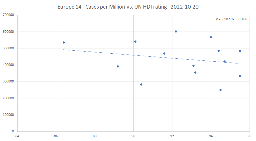
That’s quite a significant trend; each extra point on the human development index is reflected in a drop in the trend line of almost 1% in the proportion of the population who become cases.
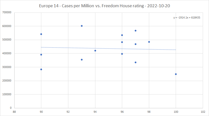
The Freedom House index seems to have far less effect on the cases per million than the UN rating does.

Population density does seem to have some effect of raising cases per million in the core of Europe, but the effect is small. Low population density is certainly not a guarantor of low cases per million.
Deaths per million
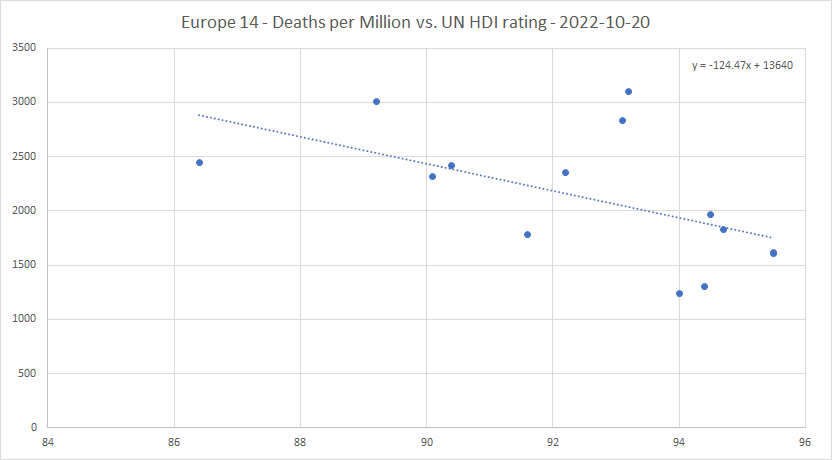
This, again, is a significant trend. Each extra point in HDI rating “saves” about 125 deaths per million.
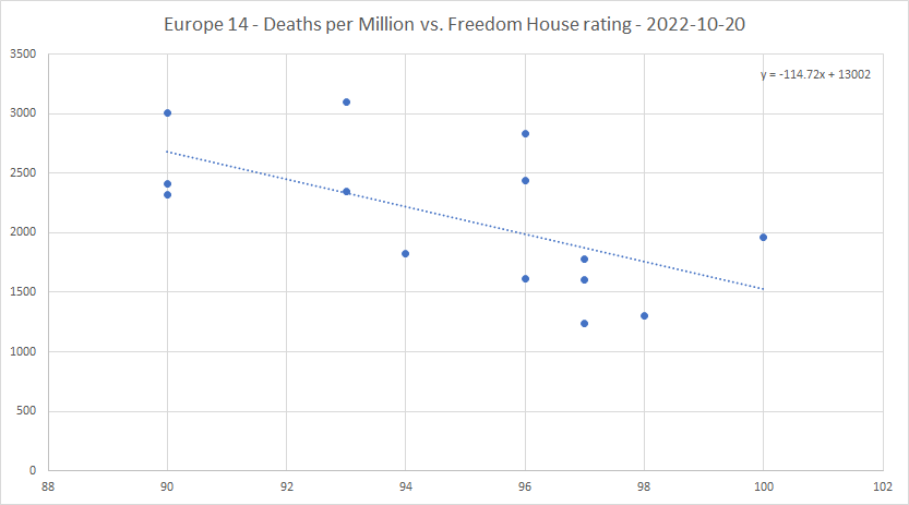
The effect of the Freedom House rating on deaths per million seems to be much more significant than on cases per million. Each extra percentage point on the Freedom House rating “saves” about 115 deaths per million from COVID. Freedom saves lives, at about the same rate as “human development” in the UN’s terms does.
And the bottom five in freedom (including the UK) are all in the highest seven in deaths per million. Could this, perhaps, be because the freer the country, the better is the level of trust between the people and the government, in both directions?
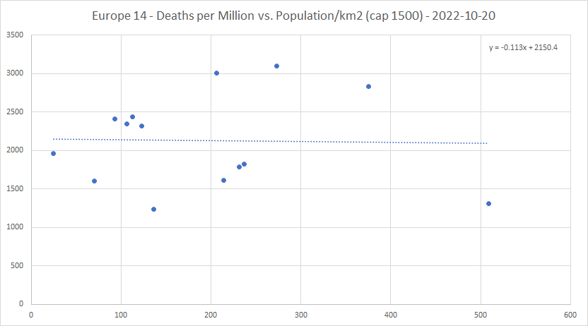
There seems to be almost no relation between deaths per million and population density. Suggesting that it doesn’t much matter how quickly the damn thing gets to you; the end result will depend only on what happens after you catch it.
Cumulative deaths per case
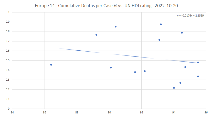
The spread of the trend line between the lowest and the highest corresponds to about 0.47% to 0.63% in cumulative deaths per case, or a ratio of about 1.34 to 1.
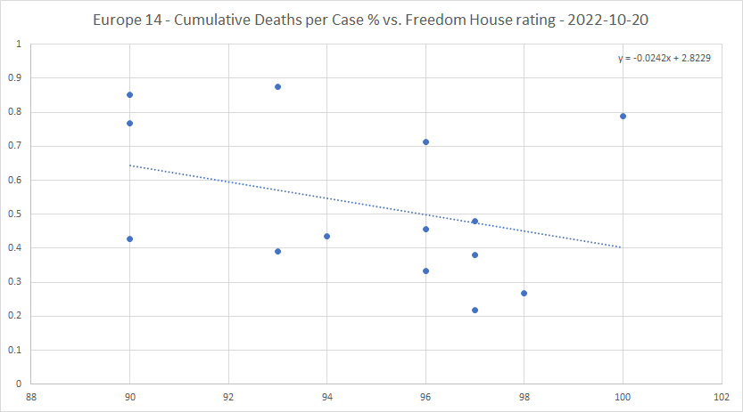
The Freedom House rating has a stronger negative correlation with cumulative deaths per case than the UN rating does. The spread between lowest and highest is from 0.40% to 0.64%, a ratio of 1.6 to 1.
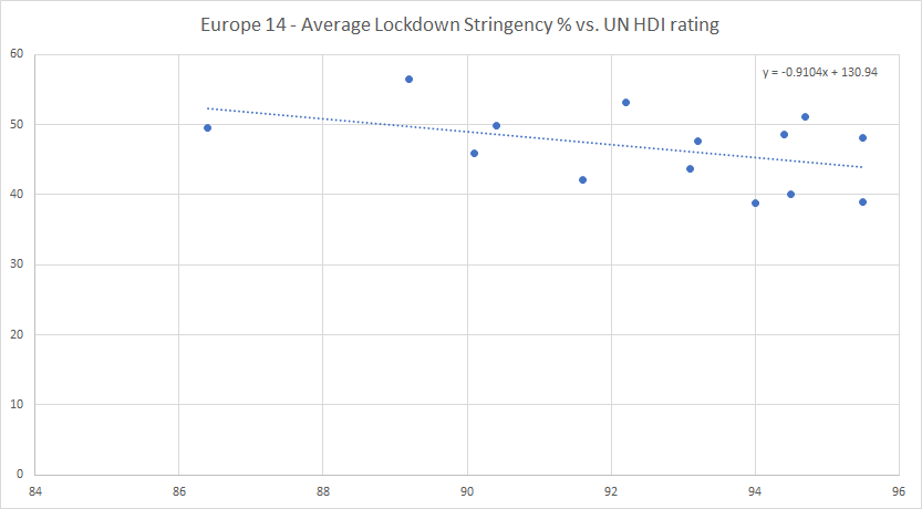
Average lockdown stringency and harshness

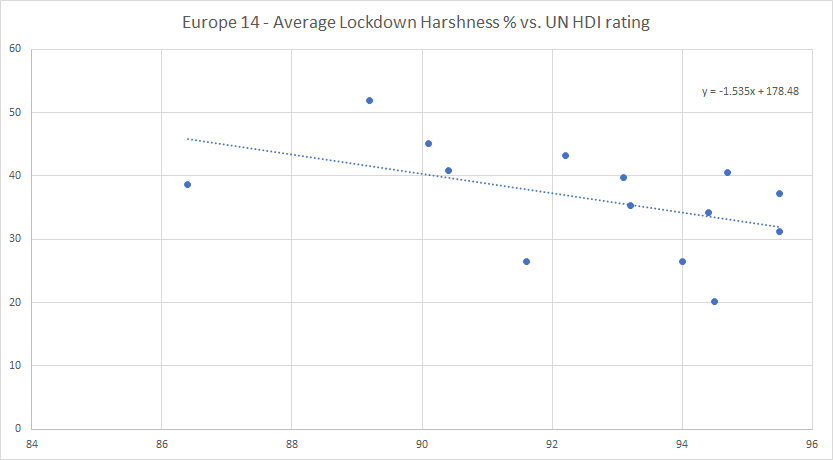
Each point of HDI rating tends to lower the average lockdown stringency by almost 1%, and the harshness by more than 1.5%. The harshness value on the trend line decreases over the whole range from 46% to 32%, a ratio of 1.44 to 1.
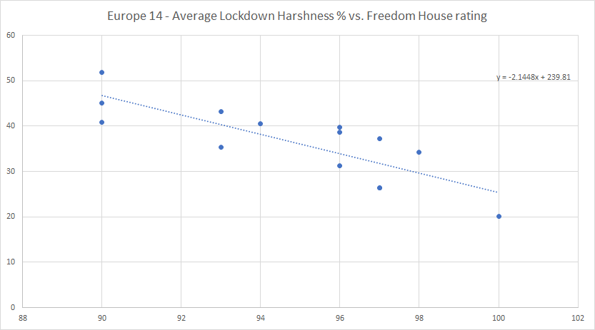
The average lockdown stringency drops by a little over 1% for each point increase in Freedom House rating, so this has slightly more effect on stringency than the UN rating. The effect of the Freedom House rating on the harshness is more spectacular, dropping by more than 2% per point of rating, and from 46% to 26% (a ratio of 1.77 to 1) over the whole range.
Which just goes to say, that the freer a country, the less prone the government will be to lock down except when absolutely necessary. The Swedish approach has been right all along. If anyone deserves a half decent freedom rating, it’s our friends the Swedes!
To sum up
- Some of the countries (Sweden, Switzerland, Ireland, UK) have cut their reporting of new cases down to a single weekly figure. Do they think COVID isn’t a big deal any more?
- The UK and Switzerland have cut down the level of their COVID public information campaigns, and Sweden has stopped its campaign altogether. Do they think the epidemic is all but over?
- The recent spurts in new cases have been greatly reduced over the last week or so in almost all the countries in the region. Without any increase in lockdowns.
- The UK has completely re-written its COVID deaths data, and the numbers are now much higher than previously. Oddly, these numbers are not yet on the government dashboard!
- Attempting to tie up trends in COVID deaths with trends in excess mortality gives mixed results, with some countries’ excess mortalities being higher than you might have expected.
- The UN’s Human Development Index correlates negatively (and significantly) with cases per million, deaths per million and cumulative deaths per case.
- The Freedom House index has far less effect on cases per million than the UN HDI does, but there is a significant negative correlation on deaths per million and cumulative deaths per case.
- The bottom five of the 14 countries in Freedom House rating (including the UK) are all in the top seven in deaths per million. Freedom saves lives!
- Population density seems to have a small positive correlation with cases per million, but almost no correlation with deaths per million.
- Both the UN HDI and the Freedom House rating correlate negatively with both average lockdown stringency and harshness. The Freedom House rating has far more effect than the UN HDI, and both ratings have more effect on the subjectively based harshness measure than on the Blavatnik stringency.
- The Swedish approach to lockdowns has been right all along. Well done to them. The Dutch have also done well.
- The epidemic isn’t over quite yet in the core of Europe. But absent another nasty variant (unlikely, I think, given that no such thing has appeared since omicron took over as the dominant variant around the end of 2021), there doesn’t seem to be any remaining cause for alarm.
Discover more from The Libertarian Alliance
Subscribe to get the latest posts sent to your email.
There was never an ‘epidemic’. It was all made up and most people bought into it.
Tom, the COVID virus was, and still is, real. I had it myself, before I had any idea what it was, and before it was officially in the UK. I know someone I passed it to, and I managed to find someone who (directly or indirectly) passed it to me way back in January 2020.
That said, there are indeed some strange things about the story. Everyone I know well enough to ask them about their COVID experience had it either very early (before the first lockdowns) or quite late (March 2022 or since). Where are the people who had it in the “raging peaks” of April 2020 or January 2021, and survived? I don’t personally know any such people.
Maybe you should criticize the reporting of the epidemic, and governments’ response to it, rather than trying to make out that the virus isn’t real. You sound to me like someone trying to defend themselves against accusations of causing “global warming” by saying, “The world isn’t warming!” That’s false; the world has been gradually warming for about 350 years. How much of that is down to human emissions of carbon dioxide, I don’t know. And neither do any of the “scientists,” despite all the alarmist crap they peddle.
I didn’t refer to the virus in my comment, I referred to the supposed epidemic. My point is that I don’t accept that the epidemic was real, though I suppose it does depend on how you want to define the word ‘epidemic’. The term is fairly flexible, but it seems obvious to me that even if there was a real virus, it was essentially harmless and any illnesses or sicknesses that people suffered were not in greater number than normal, and in many cases were in fact other illnesses that were misdiagnosed. I base this view, by the way, not on ‘conspiracy’ information available on the internet, but on official public information issued by the government! By the government’s own admission, there was no real epidemic or pandemic. It just requires you to look at the official information in an unblinkered fashion and consider what went on around you. I don’t recall seeing piles of bodies in the streets. Lots of people reported themselves ill, but people do fall ill, and sometimes people pretend to be ill when they’re not, or are ill but with something else, and so forth.
On the question of whether there was a virus (or rather, viruses), that itself is a complex issue. There may well have been a discrete virus, and even an actual illness with delineable symptoms for some. I am not qualified to pronounce definitively one way or the other on those questions, so I will keep an open mind – except to say that, unlike you, I do think that the staging of a virus that does not exist is quite possible and requires only a very ordinary, mundane explanation.
Even if we accept the broader validity of virology as a field (I regard this as a matter of debate in its own right), it is clear that there is plenty of scope in the work of virologists for false positives, and virologists must be professionally vulnerable to group reinforcement of observational biases. A virologist reading this will, of course, laugh at me and say this is all nonsense, but that’s because the virologist is thinking about the topic within the parameters of his field, which entails all sorts of self-reinforcing assumptions that may be perfectly logical and valid in their own way, and may produce empirically-verifiable clinical results (curing people and so forth), but may not in fact be true.
Science is not purely objective or rational or truth-seeking. Medicine is not an exact science anyway – and arguably, isn’t much of a science at all when it involves interaction with real people, more of a social science perhaps. Science itself is a mixture of observation, empiricism, observer psychology and politics and other things. It is, after all, a manmade endeavour. It is not difficult to imagine a scenario in which a virus is ‘found’, and the observations that support the finding are replicated by people who ‘observe’ the same things and same patterns due to their internal biases, and due to professional pressure uphold it. For one thing, group pressure is a very powerful force on the human mind. In some fields, scientists will leap at the chance to offer idiosyncratic conclusions, but in others it’s rare that a scientist will say, ‘That’s not what everybody else says it is’, or ‘The observation is correct, but the explanation is wrong’.
If you think about it, the whole field of virology is theoretical anyway: it’s a bit like asserting that black holes exist, which raises all sorts of interesting philosophical and epistemological questions in its own right because black holes are only indirectly detectable. No doubt physicists and space scientists are observing something real, but is the explanation (the black hole concept) true? Or will it be replaced by something else in the future? Will astronomers 200 years hence laugh at us for believing in these ‘black holes’ and for other ideas we hold to?
Tom, are you trying to say that all or most of the COVID “data” I have been working with over the last two and a half years is a fabrication? If that’s what you’re trying to say, it’s a large accusation, and requires a very high standard of evidence indeed to support it. Now, I have found that certain countries’ data is not believable, particularly in the context of their neighbours. Nicaragua, Belarus and Tanzania have been three examples. But that virtually every government in the world would “conspire” to fake data for an epidemic that did not exist, and to do so all but every day over a period of almost three years, beggars the belief even of a cynic like me. I know well that politicians are dishonest, but most of them aren’t focused enough to be able to bring off a trick of such magnitude.
I do think that something has caused more deaths than normal in many parts of the world over the last three years. Certainly more than ‘flu, on its own, normally would. Those excess mortality figures – which, in many countries, are produced by a completely different government department, with nothing directly to do with “health care” – strongly suggest that.
Whether government actions were an over-reaction is a different question. I think the answer to that, in the UK at least, is an unqualified Yes. The “epidemic” gave the establishment a lot of opportunities for overreach, which they duly took. And some of which (e.g. sacking care home workers who refused vaccinations) were clearly unacceptable in any civilized set-up, and are now starting to generate significant backlashes.
Ultimately, I think, it all comes down to the perversion of the precautionary principle, which Blair’s government adopted in 2002, that turned “Look before you leap” on its head, and made it into something like: “If there is a risk or potential risk, then even if we don’t know how bad it might be, government should take action against it.” That’s the philosophical hydra that we freedom lovers have to strike down.
As to the science, I think there’s a big divide between virology, the study of viruses, and epidemiology, the modelling of epidemics. It was epidemiologists like Neil Ferguson that provided the grist for the fear-mongers to ratchet people into panic mode. Evidence-based scientists like Carl Heneghan didn’t have a hope against that stuff. This is exactly what is happening in “climate science” too – climate modellers provide the scary headlines, while the people who look at the facts (meteorologists) are sidelined or ignored.
“Tom, are you trying to say that all or most of the COVID “data” I have been working with over the last two and a half years is a fabrication?”
Neil,
Somebody of your intelligence must be aware that statistics can be turned to whatever purpose is at hand. It is very dangerous to take statistics at face value. You hardly need me to tell you that.
However, my point is not necessarily that the statistics have been fabricated, more that the statistics may be recording a poor or incomplete explanation.
If it is decided that Y phenomenon is caused by X, the duty of the official statistician is to record it mathematically, not to question the explanation.
I am questioning the explanation that the statistics record, ironically partly on the basis of what the statistics tell us. The official statistics produced by the government tell us that it’s not an epidemic. Or rather, they tell us that the only epidemic is that of people putting on surgical masks without good reason and willingly lining up for unnecessary injections. If I didn’t know any better, I would say that we have been subjected to a deliberate and organised involuntary experiment in social psychology.
Or to put it in plain man’s language: I think it was all a pack of lies.
If X is a lie or a giant mistake, that is not the fault of the statistician (assuming the statistician is not complicit in the fraud). He just records and presents analysis of data within a given frame of reference.
Similarly, the virologist is acting within a given frame of reference, which is made up of his own training and certain academic, clinical and professional assumptions he makes that, together, make up the field of virology and are what make him a virologist.
The virologist looks for:
– things that are viruses; and,
– things that are not viruses.
He does not, however, look for things that negate his work conceptually, and if he found something that could call into question the whole field, he would not record it as such, and probably would not even recognise it as such. You will say that this is not the job of the virologist. He is there to carry out ordinary scientific work, not breach paradigms – but that is precisely my point.
Yes, Tom, statistics can be misinterpreted. And sometimes, they are misinterpreted deliberately, most often by those that want to present a one-sided picture on the issue. Politicians have certainly done this over COVID. For example, Hancock mis-stating the numbers of COVID tests done, to give an impression that more testing was being done than actually was.
But I still think that your claim that there was no epidemic goes a bit too far. When I look at the counts of COVID patients in intensive care unit beds, for example, I see a peak of 4,077 on January 22nd 2021. I have a figure for the UK of 6.6 ICU beds per hundred thousand population, which for a population of 68 million gives a little less than 4,500 ICU beds in the whole country. That is an enormous proportion to be occupied by sufferers of a single disease. Either (1) the NHS got the numbers wrong (possible, but unlikely if the counts were done honestly), or (2) something caused a near-filling of the intensive care units at that time. If that something wasn’t an epidemic, then what was it?
As to scientists in general, a lot of their time is spent filling in gaps in knowledge, working within an existing framework of knowledge. But a good scientist ought to have at the back of his mind a sense that scientific paradigms can, on occasion, become broken, and have to be re-constructed. These are Thomas Kuhn’s “paradigm shifts.” As, for example, the Michelson-Morley experiment, which put paid to the idea of the “luminiferous aether,” and led Einstein to put forward the ideas of special relativity.